I tend to be an extremely methodical student. I take notes, make outlines, and study by teaching myself the topics I’m learning. I also like to create step-by-step methodologies to solve problems. For example, for calculus classes I would create step-by-step outlines of how to solve derivatives, differential equations, etc. Likewise, here is a data-statistical analysis workflow I created for each time I start a new project. Of course, steps depend on the data at hand, but this helps organize topics into data munging, visualization, analysis, and even theory.
##Data Science Methodology & Workflow
###Preparation
* Formulate a problem and think of solutions and applications
* Create a source control repository to save all work
###Gathering Data
* Any data that we can possibly acquire and that could be relevant to the problem
* Web Scraping
* API
* Inport files
###Cleaning data
* Check for NAs or NaaN
* Check for missing data
* Consider irrelevant indicators
* Understand values for quantitative data and categories for qualitative data
###Exploratory analysis
* Plot the data with graphs and charts; consider the distribution (it will affect model you pick)
* Apply basic statistical correlation between variables, if applicable
###Visualization
* Create visualizations to show, explain, and more deeply understand your data; use tools in R, Tableau or d3
* Use visualizations to determine which predictors are relevant and consider using these as features for your model
###Statistical – Predictive modeling
* Begin formulating and implementing a statistical model for the data. Do I want to predict? Do I want to find out if there is a relationship between variables? Do I want to find clusters in data?
* Look at a scatterplot matrix of your data
* Choose features and create new features from the variables you have - log or quadratic versions, new categorical variables from quantitative ones
* Tip: Use the Box-Cox test to normalize data (only for some data); recall that transforming data alters interpretation of coefficients
* Choose a model, but understand the underlying model assumptions, importance of features, over fitting, and other shortcomings of the models
* Recall that correlation does not imply causation and that all models are wrong, but some are useful
* Evaluate yoru model. Look at R^2, adjusted R^2, plots of fitted versus residuals, and other evaluation metrics
##I would love to hear about your data scientist workflow!
I can’t begin to count the number of times I downloaded a new dataset to work on or describe the accompanying feeling of excitement, the rush to find new answers. Anyone who gets turned on by data has felt it. And amidst that rush, you forget about the basics. You jump at it and apply any algorithm to see what you come up with. But this could be the beginning of a big data science mistake.
Who doesn’t love a yhat blog post? I certainly do, but a section of this post really struck me. It describes Random Forests as a good-for-all algorithm that you can apply to any dataset and will get good results. Now, this is not a criticism of the algorithm itself, but a criticism of the idea that when in a doubt we should turn to the most reliable of models. What about the assumptions? Did you consider overfitting, bias, variance, etc? Just because a model has been proven to fit data well does not mean we should abuse it.
This read, in addition to the many conversations I have had with more advanced data scientists and the comments I read all over the Internet telling aspiring data scientists to just “start playing with the models,” makes me question the direction that the field is turning. Do we want people who can simply code the algorithm and make hasty conclusions, or do we want trained statisticians and analysts who can best choose the models to use?
And I get it. Data science has opened its arms for open-source work and newcomers (including me). Moreover, the huge demand for data scientists results in new degrees and bootcamps are popping up everyday to meet this demand, but we cannot allow for data “science” to lose its rigor. For in fact it is a science with a methodology.
That said, this comes from a currently inexperienced data analyst, one who has not yet delved deeply into the mathematical assumptions of these models. But my lack of experience doesn’t make me gulliable. I wince every time I hear a data scientist say “oh, just download some data and apply some models - that’s how you learn”. Yes, that’s how you learn to clean data and to code a model, but did you learn much about what this model is best for?
Here is my biggest concern. When we communicate to people who are learning data science that it is ok to just throw models indiscriminately on data or when we unexplicidly say that you can become a data scientist by doing a 12-week bootcamp, we are putting the data and results at risks. We are telling people who may not understand the models (including me right now) that it is fine to make conclusions - even to make policy choices - just by applying a model to the data. This is risky and can lead to bad science, bad journalism, and bad public policy (and business) decisions.
I don’t want to be good at coding a model - I want to be a good applicant of theoretical assumptions to solve problems in the real world.
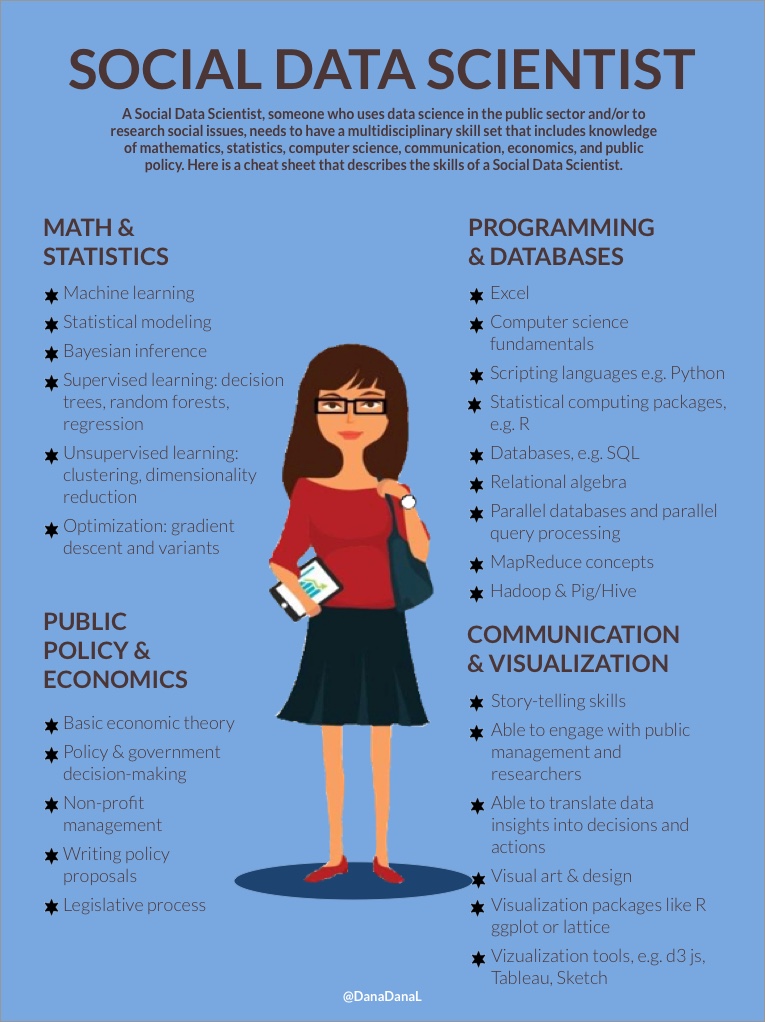
And here again, another blog post about the definition of a data scientist. I have read TOO MUCH about this topic - and the hype is getting old. But I wanted to write about a different type of job - that of the “Social” Data Scientist.
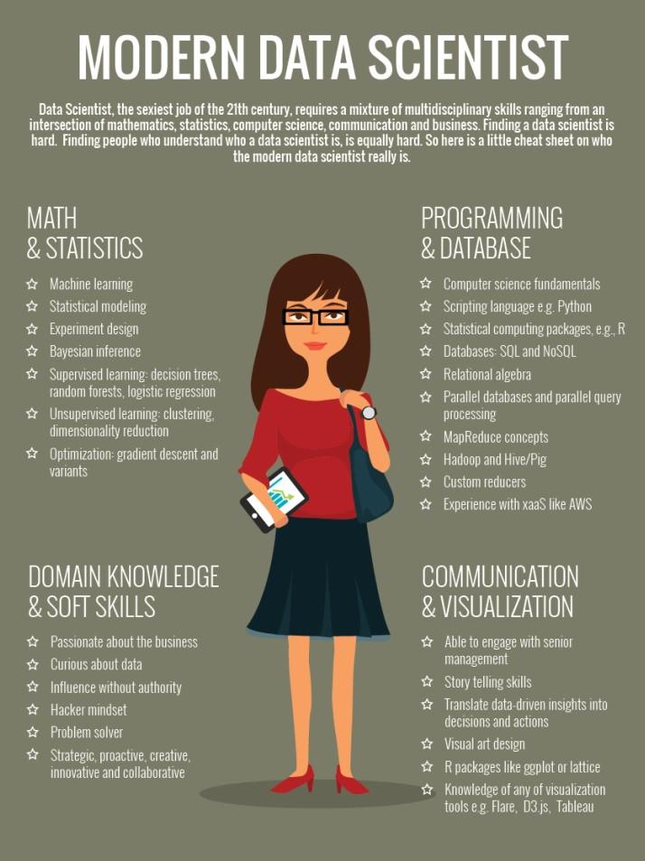
I came across the infographic below about the skills of a data scientist. For the last few years, everyone - from recruiters, to CTOs, to data scientists themselves - has also been talking about the multidisciplinary nature of the job. This Venn diagram by Drew Conway also explains the mix of Substantive Experience - Math & Stat Knowledge - Hacking / CS Skills a data scientist must have. Of course, few have mastered all three topics, but you can find great data scientists whose skills lie somewhere in that Venn diagram.
Data science has seeped into all industries and sectors of the economy. But beyond business, the tools of data science have the potential to revolutionize the work of government and non-profits. This is why I decided to create an infographic of the “Social” Data Scientist.
The biggest distinction between a data scientist who works in business and one who works in government or non-profit is the Substantive Expertise or Domain Knowledge section. While a business data scientist must know about management, the product, branding, marketing, etc, a social data scientist has to be knowledgeable about economic and political theory, the legislative process, and how governments and non-profits manage and communicate. Being a Social Data Scientist is more than loving the data and the analysis. It’s about understanding the scope and environment in which the data is collected and how the data can influence policy-making. Masterful statisticians and database administrators work in the public sector, but without having the economics and public policy domain knowledge, these individuals may not know how to use their data and analyses for optimal social outcomes.
Economists and statisticians have done and continue to do the analytical work of government. On top of that, university professors continue to perform quality quantitative social science research. But, the social data scientist has the opportunity to bring skills from the private sector and modernize the public sector. In my opinion, a social data scientist has a big burden. He/she has the opportunity to go beyond the prolific university researchers and the sometimes dogmatic economists and take action - with data in hand - for social change. More than political economic theory and grassroots activism, data is the weapon for social change in the 21st century.
Inspired by Renee’s blog post about becoming a data scientist, I wanted to write down my own goals. In my mind, these goals are like sand that does not settle. They stir around, meddle and cloud my thoughts. I’m hoping that creating this list, making it public, will let some of that sand settle and let me focus on the everyday work to reach these goals.
####Short term (2015):
Get accepted into and complete Chicago's [Data Science for Social Good Fellowship](http://dssg.io/)
Didn’t get in - turns out this year the program chose to accept individuals with a lot of computer science experience and little public policy experience - instead of individuals from public policy who are computer science beginners
Get accepted into and begin a graduate degree at either the University of Chicago or Barcelona GSE
Done! Got in to UChicago!
Compete in an online data science or ML competition
Done! Participated in Driven Data’s Pump it Up competition
Fork and contribute to a GitHub open-source project
Get better at creating visualizations with R packages
Learn d3 and other visualization tools
Use Python more frequently for data munging
####Longer term (2016-2017):
Complete graduate degree
Find employment with a team who uses data science in the public sector
Pursue another certification or even get into a PhD program
####Longer-longer term (2017-):
Start my own team of analytical consultants or my own product
This is a working list. I will add more goals as I think of them.
More than reading textbooks or watching videos, I learn by looking at someone else’s project, running through the code, and imitating his/her steps to learn about the analysis. Writing this post also pushed me to understand the code; otherwise, I wouldn’t be able to write about it.
I came across Vik Paruchuri’s blog and was happy to learn about someone who also began a career in the social sciences, someone who - as Vik claims - was afraid of math, but who learned how to use computer science tools and analytical thinking to work on socially-oriented projects. I thought - since Vik came from a similar educational background, then maybe he would have examples that would interest me.
I took Vik’s analysis of a huge Medicare dataset from the Center for Medicare and Medicaid Services. This dataset provides information about 880,644 healthcare providers across the country who provided 5,949 unique medical services to Medicare beneficiaries. From this dataset, we learn for the first time how much healthcare providers are paid for the services they render to Medicare beneficiaries.
###Convert, understand, and load the Medicare data
Vik’s post was not for absolute R beginners. For example, he assumed that I would have enough RAM to be able to open the data. He challenged me in this respect. After downloading the tab delimited txt file, I attempted to create an SQLite database that I could use to read from R - but this proved too tedius. Then, I Googled around to see what others do to work with big data in R. I came across the ff package and decided to use that. Finally, I used a bit of Python to transform the data from txt to csv, just in case the ff package gave me problems with txt files.
importcsvtxt_file=r"mytxtfile.txt"#name of your input txtcsv_file=r"mycsvfile.csv"#name of your output csvin_txt=csv.reader(open(txt_file,"rU"),delimiter='\t')out_csv=csv.writer(open(csv_file,'w'))out_csv.writerows(in_txt)
Here’s an explanation of the data variables, but these are the important fields:
npi, the National Provider Identifier, is a unique physician ID
hcpcs_code is a unique ID for a service the doctor performs
line_srvc_cnt indicates the count of a specific service the doctor performed
average_Medicare_allowed_amt is the sum average of what Medicare pays and what the beneficiary and/or a third party is responsible for paying (averaged for each service)
average_submitted_chrg_amt is the average charge the physician submitted for the specific service
average_Medicare_payment_amt is the average amount Medicare paid the doctor for the service after deductible and coinsurance
And here is how I started working with the file in R:
library(ff)setwd('/Users/myDirectory')#enabling VERBOSE allows you to see how many rows it has uploaded
data<-read.csv.ffdf(file="MedicareLARGE.csv",header=TRUE,VERBOSE=TRUE,first.rows=10000,next.rows=50000,colClasses=NA)head(data,n=2)#my second row has a copyright remark, so I created a new dataframe to eliminate it. You don't have to create a new frame - it's just a habit.
data2<-data[-1,]#disable scipen so I don't see exponential values
options(scipen=999)
Depending on your RAM, this could take a while to load and to view, but I always like to give the data a quick glance. Notice that the submitted charge amount seems to often be greater than the Medicare allowed amount. Is this another example of doctors inflating service prices to get more out of insurance? I’ve had some experience with this, but this is just first-look speculation and something I may not be able to investigate through this dataset.
##Aggregate data by npi
Notice that the data does not have a primary key. We have all 9 million rows of data, with multiple rows representing the same doctor who performed different services. We want to aggregate the data so each row represents one doctor. Let’s use the data.table library for that, which extends the capabilities of core R’s data.frame with speed of many features (so good for big data sets). Use this cheat sheet for data.table.
Vik first analyzed income inequality among doctors. That is, we want to see what percent of doctors makes what percent of total income. To do this, we have to filter by doctors-only because the data includes organizations (labs, hospitals). Follow Vik’s post to see how he analyzed this. As he mentions, there is evident income inequality in this data, but we cannot make this a generalization for all doctors. Remember, this is Medicare data - some doctors do not bill Medicare much. Vik also analyzes gender-based inequality by medical occupation, shows a map of where the top-payed doctors are, and looks at the correlation between state life expectancy and Medicare spending by ethnic group.
##Challenges
I got to learn a lot from Vik’s post through many challenges I faced. For example, when Vik showed how to aggregate the data, he did not include the nppes_entity_code, which is the code that indicates if the npi is a doctor or an organization. Later, when he filtered doctors out, he referred to the phys_summ data, but mine did not include the nppes_entity_code. I had to figure out a way to include it. It seems that R didn’t allow me to create phys_summ BY npi and then BY nppes_entity_code, so I looked for a way around it. I recognized that nppes_entity_code had 7 rows with “.” as the code, so I filtered these seven rows out of our data. I re-created phys_summ without the seven rows, and then I created a new “code” column in phys_summ with an ifelse statement.
#create new column named code, if the nppes_entity_code was
#I, give that row I, else give it O
phys_summ$code=ifelse(data3$nppes_entity_code=="I","I","O")
I’m sure there is a better way to do this - let me know if you think so. Regardless if the method, at least now I could work with the doctor-only data! If I wanted to mock Vik’s gender-based analysis, I also would’ve had to do something about including the physician type and gender in phys_summ.
##What I learned:
* Working with big data in R - the ff package and data.table
* Aggregation in R
* Cool insights about Medicare
##What I need to learn:
* d3 to create beautiful visualizations like Vik’s
* Aggregation by two factors

 credit to